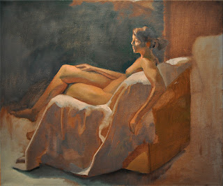
Dan Thompson! I've been looking at a lot of this master colorist's work lately; it's the perfect blend of drawing, color, and paint application (in my opinion). Check out his stuff: http://danthompsonart.com/
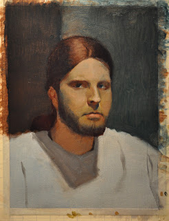
Between looking at Nelson Shanks, Dan Thompson, and my teacher, Vilas Tonape (a master in his own right), I'm getting very interested in color and its many applications in portrait painting (or in any kind of painting). So in this painting below I'm really trying to see as many colors as I can and touch upon them, though there are still many I haven't yet visited. This lighting set-up was ideal for catching those warms, cools, and the interesting colors in-between.
Sunday, July 31, 2011
oh, Dan...Thompson!
Labels:
Dan Thompson,
Nelson Shanks,
Self Portrait,
Vilas Tonape
warm v. cool
This is probably the most fun I've had on my self portraits so far; I forced myself to mix quickly and really lay it down fast, in chunks, blocking out the planes as I saw them, instead of noodling the paint around. Most exciting part was putting down that first swipe of cad red, its fluorescent! Haha.
Getting the tones between the warm light and the cool light was tough, keeping them hueful and un-muddied was an interesting battle. Its amazing how many colors you can find when you look hard enough; there were many subtle hues that I did not put down.
More work to be done, update either later tonight or tomorrow.
PLUGGING: Vincent Nappi
http://dashanddaring.blogspot.com/
I first met this passionate aficionado of artistic adventure during my first year at Ringling College of Art and Design. He's one of the most driven people I know personally studying illustration as a student, and he's taught me a fair few things about making art, though mostly indirectly. He just finished studying with all of the amazing instructors and an incredible class of students at the Illustration Academy and is planning on continuing his education at TAD.
Check out his work at his blog, Dash and Daring, where you'll find tons of great pencil and ink work along with some nice narrative as well.
He already has a unique voice, and a very nice skill set; as with all of my plugs, he proves that the future of illustration is looking very bright for all of us.
Saturday, July 30, 2011
PLUGGING: Philip Whisenhunt
http://civilmouse.blogspot.com/
So I met this cool kid at Ringling's Pre-College Perspective program many moons ago, and he has since improved at an awesome rate. He currently is studying at Virginia Commonwealth University under the likes of incredible illustrator and fine artist Sterling Hundley. I've known few this dedicated to their passion and I'm happy to represent him on this blog. I can't wait to see what he turns out after his 4 years at VCU are through.
He's sure to become a big name in the future, I can feel it.
This may be the first post in a series of PLUGGING posts, where I highlight the names of friends of mine that I know will be seeing the limelight in a short while. Keep on trucking guys!
small painting tips
I'm keeping a list of short notes and quips about painting to think about in sticky form.
Here's a few:
-When painting the iris of the eye, keep its edges soft; it is often in deep shadow due to the brow ridge, and if not, at least from the upper eyelid, whose shadow very often connects the dark shape of the iris to the dark shape that is the shadow of the top lid. And even if this shadow is not prominent, the fact remains that the iris is not a solid object and it is set back in the eye socket.
It is important to consider the location of a piece of color or an edge in space, as this will determine how hard or soft that edge or piece of color should be. Richard Schmid says this of the iris in one of his DVDs in which he is painting a portrait from life.
-"Is what I am about to do going to better or weaken the painting?" (Another Schmid quote)
-Everything in your painting can be determined before you do it... for those struggling with "how hard or soft should this edge be", or "what color is that spot on the nose", all of this can be determined without guesswork. The word 'relative' is very important in art; for example, it is very easy to determine what your hardest edge is and what your softest edge is, what your strongest hue and what your weakest hue is. They are the extremes, absolutes.
Just like moral absolutes and political extremes...the real subtlety and truth lie in between. Absolutes and extremes are important to give a spark to your work. A person without strong opinions on anything could be considered boring, and the same could be said about a painting, whether its a soft (think Eugène Carrière) or hard-edged (Mondriaan and van Doesburg) one. One is not better than another; again, relative is the right word. It is all relative to your goal, what you want to convey.
But to come back to the main point; if you want to know how hard or soft to make an edge, you must consider first your hardest edges and your softest edges. This calibration is what allows machines to put things in their proper place, and we do the same.
Darkest darks and lightest lights in first is a similar sentiment, though there is no need to actually place them on the canvas. What is more important is an AWARENESS of these absolutes, a taking of them into account. Sargent said to work from the middle ground-out, so as to avoid false accents, but you know he was aware of what his darkest and lightest spots of color were. Now Sargent doesn't even have to think about this stuff because of his god-hood, but that's beside the point.
Knowing what something specific is will indirectly teach you what something else is not. This makes the decisions we have to make much easier. However it is all grounded on that one spot or edge we do know for sure. It is like a sound argument; it must have a logical premise, or else the entire argument is pointless. It proves nothing. Our logical premises to the argument that is our painting are these accents we know and understand, like that razor-sharp edge on the nose or that strongly red flesh-tone on the halftone of the cheek where subsurface scattering is bouncing that chromatic light around.
The halftones are what is difficult- of course to say that one must follow what I have read above would also be similar to prescribing to an extreme or absolutist position, and common experience tells us all that absolutes are not natural. Experiment and feel free to disregard everything above to find what works for you. One very absolute thing is that I will very likely come to disagree with what I believe at the present; and that's fine.
The one thing that will help your painting more than anything, much more than reading my shitty blog posts, is painting.
Wednesday, July 27, 2011
ambition
can i make a decent painting of myself with a warm light source from underneath and a cool light source from above? who cares im gonna try
Monday, July 25, 2011
clutch

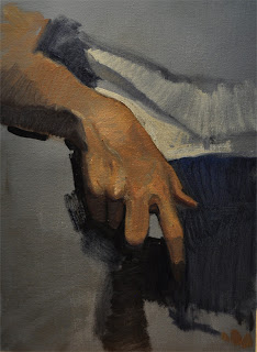
Sometimes hands are the worst, but I had very few problems with this quick study this time around...one I did have was getting the exact color of the main light. What with subtle, neutralized blues and greens and reds in even the main light of the hand, getting it all to work together took some work, and I'm still not sure I got it how I saw it. Oh well.
Sunday, July 24, 2011
Thursday, July 21, 2011
Wednesday, July 20, 2011
another self portrait update
Monday, July 18, 2011
studying color
This began as just a color study of a nose, but as I had fun with it it just got bigger. Since I didnt begin with a whole head and proper proportion, stuff is out of place. But I don't care, since its all about color. lol.
I'm beginning doing color with my teacher, Vilas Tonape, and I've known few who can handle color like he can.
This was never meant to be a full head so I dont know if I will make it one, but anyways
I'm beginning doing color with my teacher, Vilas Tonape, and I've known few who can handle color like he can.
This was never meant to be a full head so I dont know if I will make it one, but anyways
Tuesday, July 12, 2011
summer studying
Haven't made a post in a while- I'm currently taking a figure painting class with my old instructor Vilas Tonape: www.vilastonape.com
He's a real stickler for foundations, the most important aspects of an artist's training; he's an excellent teacher. Unlike other teachers who cannot perform what they teach, every class he stands alongside us and paints; he is demoing constantly.
Anyways, these are all mainly academic works; hoping to get back to some other kinds of painting soon!
Subscribe to:
Comments (Atom)


